O’Phish
Case Study
 PRODUCT: Website ROLE: UX DESIGNER YEAR: 2017/2018
1.2 What is Currently Out There
1.3 Identify the best way to make O’phish user-friendly
2.1 What are the current pain points?
INTRODUCTION Top ![]()
What is phishing?
Phishing is the attempt to obtain sensitive information such as usernames, passwords, and credit card details by disguising as a trustworthy entity in an electronic communication. The word is a neologism created as a homophone of fishing due to the similarity of using a bait in an attempt to catch a victim. According to the Microsoft Computing Safety Index, the annual worldwide impact of phishing could be as high as US$5 billion.
Phishing is typically carried out by email spoofing or instant messaging, and it often directs users to enter personal information at a fake website, the look and feel identical to the legitimate ones – the only difference being the URL of the website in question.
Communications purporting to be from social web sites, auction sites, banks, online payment processors or IT administrators are often used to lure victims. Phishing emails may contain links to websites that are infected with malware.
Attempts to deal with the growing number of reported phishing incidents include legislation, user training, public awareness, and technical security measures.
Businesses need to adopt anti-phishing strategies to safeguard confidential information from competitors. One strategy for combating phishing is to train people to recognise phishing attempts, and to deal with them. Education can be effective, especially where training emphasises conceptual knowledge and provides direct feedback.
What is O’Phish? Top ![]()
O’phish is a platform that can be used to train employees of a company in anti-phishing techniques. O’phish is a Phishing Simulator and it delivers a complete solution to assess, train, and test employee vigilance across a company.
The main objective of this project was to create UX design deliverables to guide the team to improve the current user experience on http://client.ophish.com/. O’phish’s interface must be intuitive and user-friendly. The business goal is to attract and retain O’phish customers.
Project management and client relationship Top ![]()
We have a team of three people: A product owner, a developer and me. We work remotely. We have an open channel of communication and cooperative work. I suggest the plan and schedule, and we define the work process, task prioritisation and milestones.
The opportunity Top ![]()
Discover what the user needs in order to plan and conduct successful training strategies against phishing.
1. DISCOVERY Top ![]()
During this stage, I conducted the research. I looked at the competitive landscape and interviewed potential users.
Who are we Designing for Top ![]()
As part of the user research I defined three personas who would be the primary users of O’phish:

1.1 Understanding the users Top ![]()
Methods: user interviews
During the research I conducted interviews and user tests to gain insight into what people experienced when using the O’phish website:
A) The user doesn’t know about the opportunities offered by O’phish
B) The users have problems signing in and creating a campaign, and they don’t know much about the outcome.
C) The users think phishing their employees for training purposes is useful. They have to trust O’phish not to use their personal information in an inappropriate way
“It would be great to find out who are the weak links in the company and offer them special training”.
Anna
1.2 What is Currently Out There
1.2 What is currently out there Top ![]()
Methods: competitive analysis
We conducted extensive competitive research among direct competitors. Here’s a short summary that highlights a selection of competitors and the key findings that are relevant to our project.

O’Phish’s competitors
Looking at competitors’ websites, it’s clear that a good landing page is key. They clearly explain the methods they use to tackle phishing. They offer demos, have testimonials and present satisfied user profiles.
1.3 Identify the best way to make O’phish user-friendly
1.3 Identify the best way to make O’phish user-friendly Top ![]()
Methods: user flow
Current user flow to achieve the main objective on the website: create a campaign.
 User flow
2. DEFINITION Top ![]()
2.1 What are the current pain points? Top ![]()
Experience map
Determine how people approach O’phish and locate current pain points.
 Experience map
The pain points are related to filling out forms. Users don’t like forms because it takes time. Users don’t like:
- Forms that ask questions they don’t know how to answer
- Forms with multiple-choice questions that don’t have the choice they want
- Forms that ask for too much information, or information they’d rather not give
- Forms with huge quantities of information or confusing instructions
Establish trust: We must declare the purpose of the form. Why they should fill it, what benefits will they get by doing so and, most importantly, how the provided information be used by O’phish.
Reward the user: Everybody likes to be rewarded after completing a process. Sometimes a smaller yet immediate reward can be more motivating, than a bigger in the future. This can be done with simple feedback messages indicating that the user has done a good job. We have to choose a reward that covers the effort of filling out the form.
3. DESIGN Top ![]()
Test initial ideas, create paper prototypes and digital wireframes.
3.1 Idea generation Top ![]()
Methods: design studio
I brainstormed ideas around such topics as how the user can approach a phishing simulator. I tested the current website with users and identified usability problems.
3.2 Testing initial ideas Top ![]()
Methods: rapid paper prototype, user testing
Based on the ideas generated during the brainstorm, I created rapid paper prototypes and tested it with users. I went through several rounds of iterations to ensure that users could complete the tasks and understand the functionality behind the features.
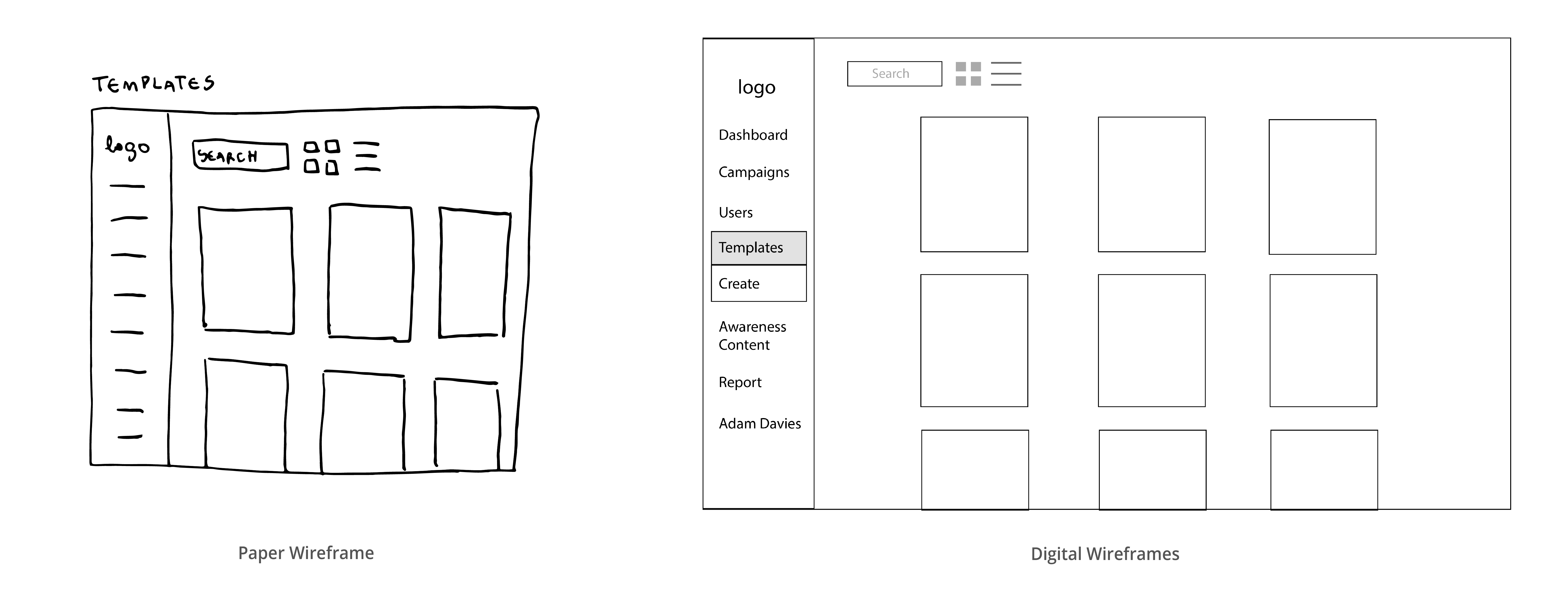
3.3 Iterative evolution Top ![]()
Methods: paper prototypes, digital wireframes, user testing, clickable prototype in InVision.
Simple paper prototypes gave way to more detailed and high-fidelity wireframes that were tested and adjusted along the way.