reTrip
Case Study
PRODUCT: Mobile and desktop website ROLE: UX DESIGNER YEAR: 2017
reTrip is a marketplace for second hand flight tickets. At reTrip the user can buy buy unused plane tickets from people who purchased them, however cannot use them for any reason. These tickets are offered with significant discounts. On the other hand user can sell their unused plain tickets.
The final objective of this project is to create wireframes of reTrip in order to improve the current user experience already available on https://www.retrip.io/. The user interface would help people sell and purchase the flights they need on the most easy way possible, with confidence on reTrip website. The business goal being to attract customers to sell their plane tickets or buy second hand tickets with reTrip.
The Opportunity
Discover a way to make it easier for people to use reTrip, create training campaigns, access campaigns data and continue to train employee based on the results.
Who Are We Designing For
As part of the user research I choose three personas who will be the primary users of reTrip:

1. People don’t know about the opportunity of selling unused flights. The user tends to get some of the money back directly from the company they purchased their unused plane tickets.
2. The process of planning trips is already stressful, canceling them and dealing with the frustration of losing money is even worst.
3. There is a trust issue about buying a second hand ticket. If the user knows the system works there is no reason not to use reTrip.
“It would be great if someone else could sell my unused flight ticket for me”
Anna
Addressing risks and problems:
- Trust by association. Make a partnership with skyscanner.net: reTrip second hand tickets could be listed on skyscanner too.
- Display testimonials and success stories on reTrip main page. “I was going for a job interview in France. I booked a second hand flight on reTrip and now I am a successful chemical engineer at l’Oréal Paris”
- Have a marketing campaign placing ads on google. reTrip ads will come up when people are looking for flights.
What is Currently Out There
Methods: competitive analysis
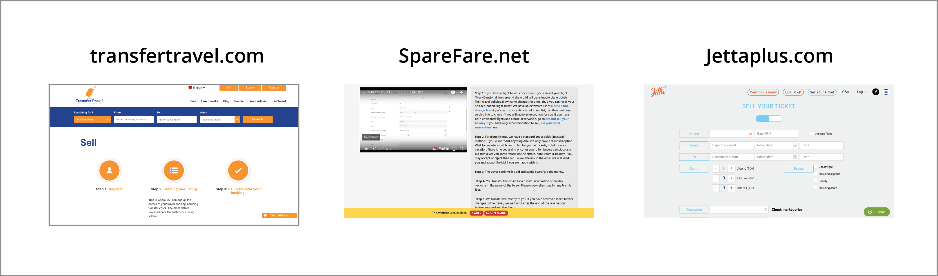
I have conducted an extensive competitive research both among direct and indirect competitors. Here’s a short summary that highlights a selection of competitors and the key findings that are relevant to the website that we are building.
The analysis of direct competitors showed that none of the websites have a strong UX Design, they are not user friendly. The competitor’s website only advertise the flights people are selling. The seller has to fill long forms and the user has to make the name exchange himself.
Opportunity: Utilise the reTrip easy to use strength and make it smooth for people to sell tickets. A simple and intuitive user interface would be truly advantageous for reTrip to get ahead of competition.
Analysis of indirect competitors
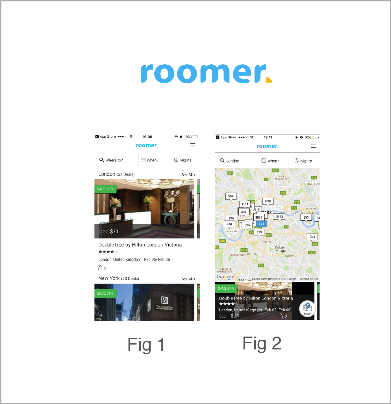
The analysis of indirect competitors (hotel resale) showed that the indirect competitor Roomer has a strong UX Design with exciting features but also some problems. Roomer is a mobile app and this is not the best option as the user tends to go for mobile websites. Roomer’s strong point is the map (fig 2) with highlighted tags and scrolling options on the bottom of the screen. Roomer problems: there is no filter to organise the search and the hamburger menu is clunky.
Cancel on has a standard user interface with too much information. The site is intended to work as a mobile app but it gets messy (fig 6). The Strong points of Cancel on are: it is not an app, works on browser, has the option to select different currencies (fig 7), has a search filter (fig 5).

Opportunity: Learn from the competitor’s mistakes and offer a solid user experience.
The the following indirect competitors have websites that can be accessed on a mobile browser. The websites have a good user experience and are well designed.
Airbnb has a clear and objective user interface. The user has to add a lot of information in order to offer his property for another user, but the process is not daunting. The Airbnb solution to the forms it’s to break down in several steps and use friendly wording. The user knows why he is adding the information: to increase the chances of making successful deals. When adding information the user feels like talking to a friend. The font size is big, probably because many users are old and might struggle to read on the phone.


Kiwi has nice feature. From the main page the user can select the interactive map to check for destinations.

Kayak also has an interactive map to select destinations. The map is activated when the user selects destination “anywhere” on the second screen.

Google flights also shows a map on the mobile version but is only decorative.

DEFINE
Determine how people approach their search for plane tickets and what the current pain points are.
Determine the landing page of reTrip addressing the problems pointed during research: Make it easier for people to trust reTrip and sell their tickets. The user has to understand what the company does.
How Do People Approach shopping for plane tickets:
Method: user interviews
User interviews really helped me to understand how people approach shopping for plane tickets and how they plan out future trips. We learnt that in general, there are two types of travellers, the ones that have a plan in mind and others that are flexible.
The first type of user usually knows where he wants to go and might be flexible with dates. The second type are free spirits that can have an adventure and travel to a distant place depending on ticket prices.
“I was hanging out with my friend and we were looking plane tickets online. We found cheap flights to go to Croatia and we decided to go. It was a great adventure and I would do it again”
Chiarina
Pain points:
People usually travel in groups. The pain point is to organise the trip with friends. If people are planning a trip together they tend to gather around one screen while one person types and search for options. If the group is is not colocated it is difficult to share the search results, there are so many options to choose from.
One option on this case would be to add the “spectator mode” so groups of people could see the screen of the trip organiser and share messages on real time.
Closer Look at Our Primary User’s Current Experience
Methods: experience map

Our primary user Matt starts his journey in buying a plane ticket with a decision to do so and inviting his friends to travel with him. They browse through inspirational ideas of where to go and refine their options. In their attempt to settle on the plan for going to Rome they begin to feel overwhelmed and indecisive. This is where Matt hits his first 2 pain points. He tends to socialise, shares ideas with friends meeting them in person and they tend to refine the plans creating a group chat on WhatsApp.
Matt and their friends will share print screens of the flight options. This is a pain point when they try to select the right flight.
When Matt and their friends make a final decision on which tickets to buy they hit a pleasant point of the experience, the most important part of the trip project is concluded. It is important that buying process is as painless as possible to ensure that Matt can successfully buy his flight and easily organise his trip.
DEVELOP
Testing initial ideas, creating paper prototypes and digital wireframes
Idea Generation
Methods: brainstorming with reTrip specialist and CEO Douglas and developers Krunoslav Banovac and Stefan Virag
I had skype calls with my teammates to brainstorm ideas around such topics as where to find inspiration, how to save ideas, where to look for examples and how to buy and sell plane tickets.
Testing Initial Ideas
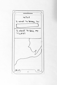
Methods: rapid paper prototypes, user testing
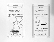
Based on the ideas generated during the design studio, I created rapid paper prototypes that I started testing with users. I went through several rounds of iterations to ensure that users could complete the tasks and understand the functionality behind the features.
With paper prototypes I had a plan to do at least four different options for the landing page. Each two screens I have done I would test it with users to check what had to be improved.


“The best products don’t focus on features, they focus on clarity.”
— Jon Bolt
“If you just keep adding features without considering overall structure, your app becomes like the Winchester Mystery House.”
— Peter Merholz
To accomplish a good design I start with a simple screen and add features as I go. There must be an option to sell a ticket and there must be an option to look for tickets.
It’s important to consider the opportunity we have to lead our users from inquiry to purchase by offering them what they need—and only what they need—at every step of the process. No more, no less. We should aim to decrease the number of steps and decrease complexity.
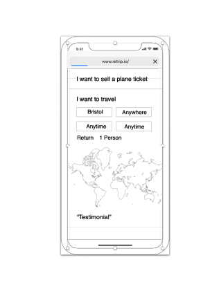
Iterative Evolution
Methods: digital wireframing in Sketch, user testing
Simple paper prototypes evolved into more detailed and high fidelity wireframes that were tested and adjusted along the way.

_____________________________________________________________________________________________

_____________________________________________________________________________________________


_____________________________________________________________________________________________